Gill Sans Nova Light
Headlines, quotes, accents
A light, airy character for modern insulation concepts.

Corporate Identity & Design 2026
The digital CI workbook for our brand relaunch: logo, claim, colours, typography and applications, a concise guide to our brand design principles.
The Brand
Our insulation technology stands for more than energy savings, it creates sustainable indoor comfort. We combine skilled craftsmanship, modern technology and responsible action.
Clear & competent, easy to understand, solution focused and free from unnecessary technical jargon.
Modern & reliable, in its visual appearance as well as its language. Our communication makes the brand visible, tangible and unmistakable.
The Logo
The logo combines the central elements of thermal protection and energy efficiency in a clear, geometric design language. A stylised roof represents protection and comfort, the essence of our value proposition.
The sun stands for warmth and energy, the snowflake for cold and insulation. Both elements are deliberately balanced geometrically, representing the interplay of summer and winter insulation.
The Claim
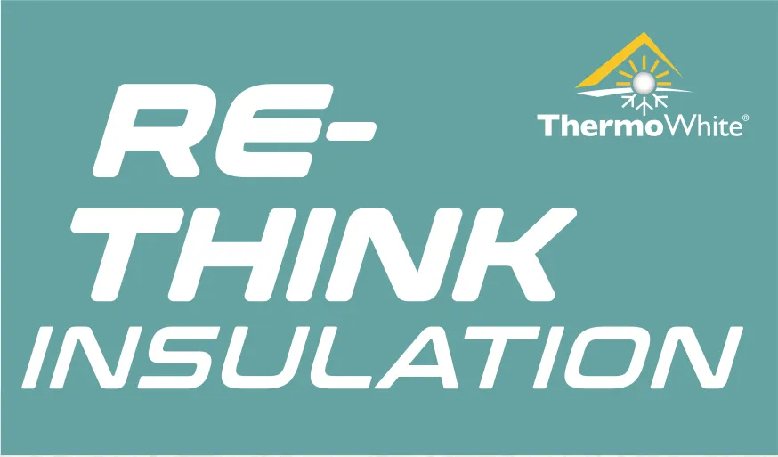
The claim expresses our ambition to rethink insulation. It is set in Gill Sans Nova Bold Italic and uppercase, preferably in white on turquoise.
The Roof Element
The roof can be used flexibly in print and digital media, icons, patterns and backgrounds. It may be scaled proportionally, but must not be distorted or treated with unauthorised effects.

Typography
Typography Aesthetics
The visual identity of ThermoWhite® is based on the clear, timeless elegance of the Gill Sans Nova type family. As our primary corporate typeface, it communicates trust, precision and quality craftsmanship.
Headlines, quotes, accents
A light, airy character for modern insulation concepts.
Body copy, core content
Clearly legible, competence without clutter.
Wordmark, claim
Re-Think Insulation
Applications: Wordmark, business stationery, presentations, marketing and advertising, consistently set in the defined type styles.
Colour Palette
Symbolises warmth, light and quality of life. It represents what our work delivers: a comfortable indoor climate in every room.
Conveys stability, professionalism and expertise. As a balancing base colour, grey communicates confidence and trust.
Stands for innovation, freshness and clarity. It represents our technological ambition and communicates lightness.
Pantone Solid Coated, digital approximation. For colour critical print applications, always verify values in Pantone Connect and against the latest physical colour guide.
Image & Video Style · Key Visuals
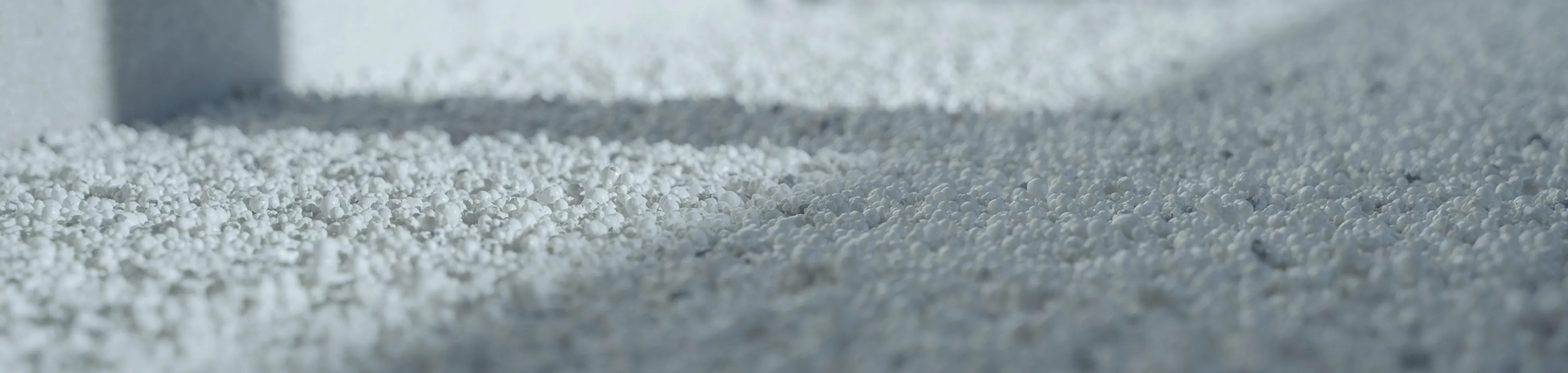
The key visuals translate product benefits into a reduced, recognisable visual language, built from EPS beads, the roof element and clear geometry.
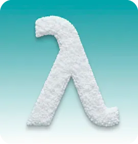
Excellent thermal insulation and improved impact sound performance
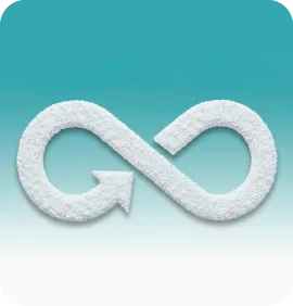
Low water content for fast drying
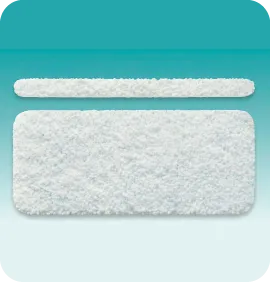
Seamless installation with no thermal or acoustic bridges caused by board joints

No cutting of boards required, saving time and reducing waste
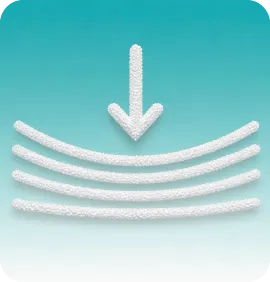
The vapour permeable structure enables subsequent drying
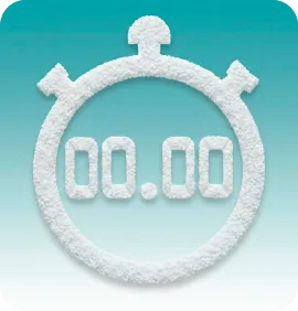
Fully automated, computer controlled machine technology
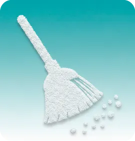
Fast, clean installation with minimal space requirements on site
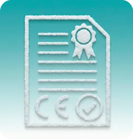
CE marking and European approval for all products
With ThermoWhite® Speed Up, ready for covering after approx. 12 hours
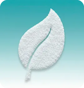
Sustainable because it can be recycled again
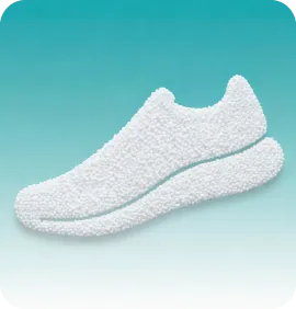
High load bearing capacity of the finished assembly
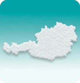
In-house quality control and independent third party monitoring (BVFS, OFI, OIB)
Applications
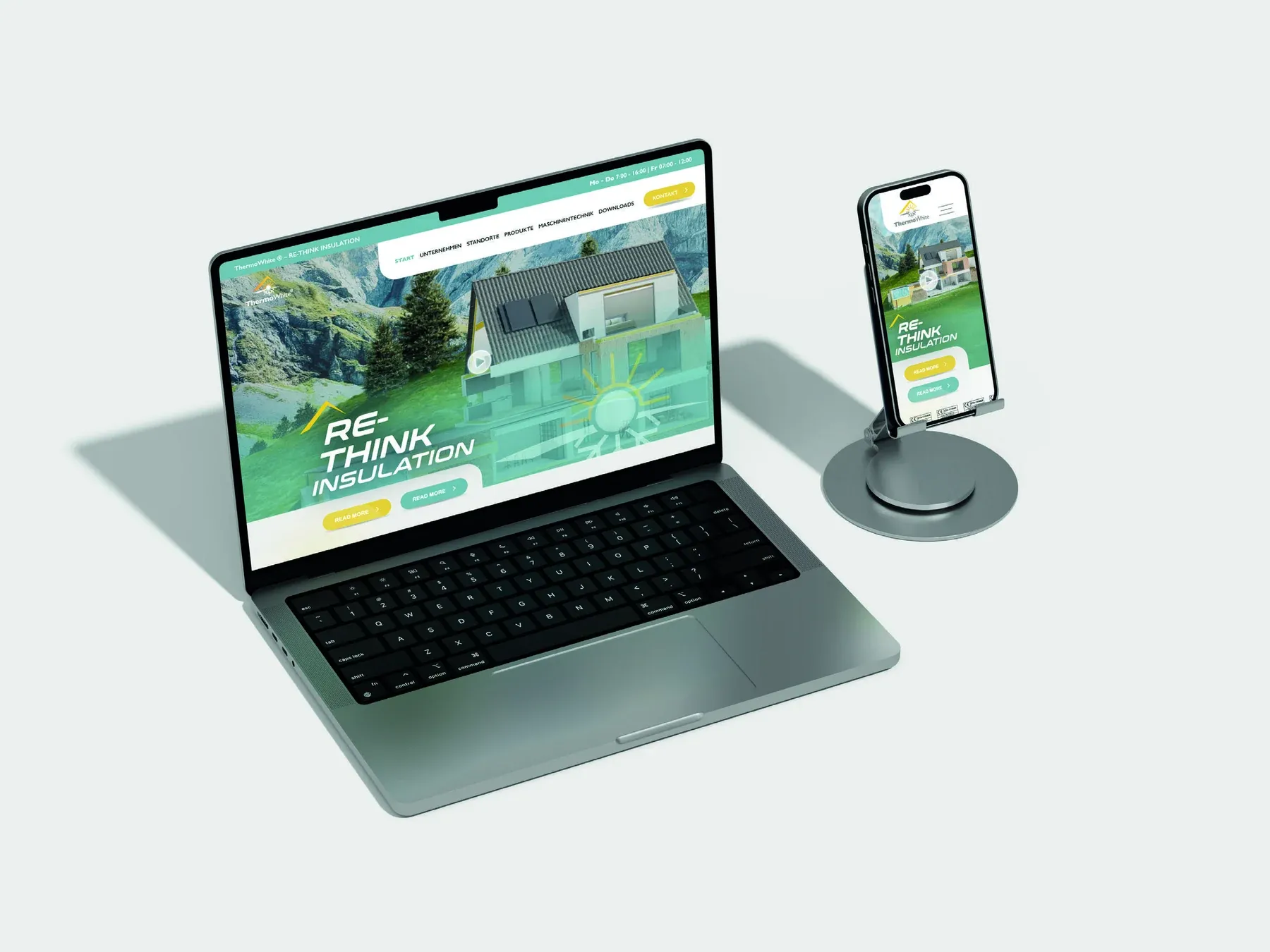
The website, social media and email signatures follow the colour palette and typography, with the claim acting as a recurring brand signature on turquoise.
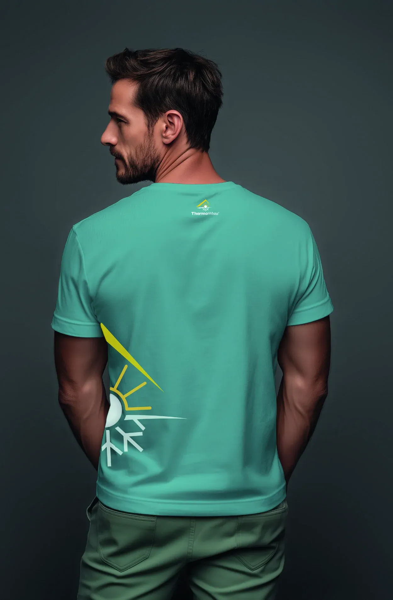
The brand becomes visible, tangible and unmistakable on the construction site.
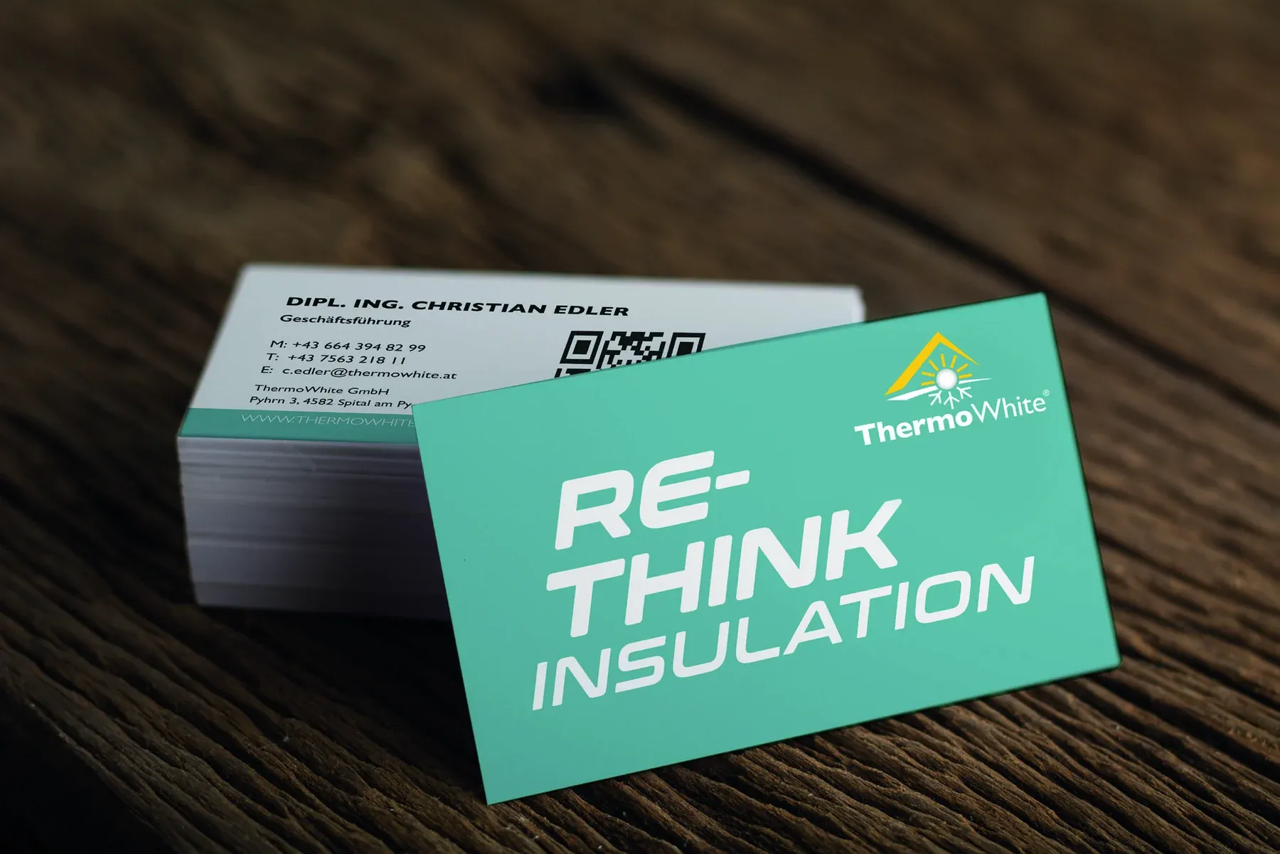
Business cards, letterhead and envelopes consistently carry the visual identity into everyday work.
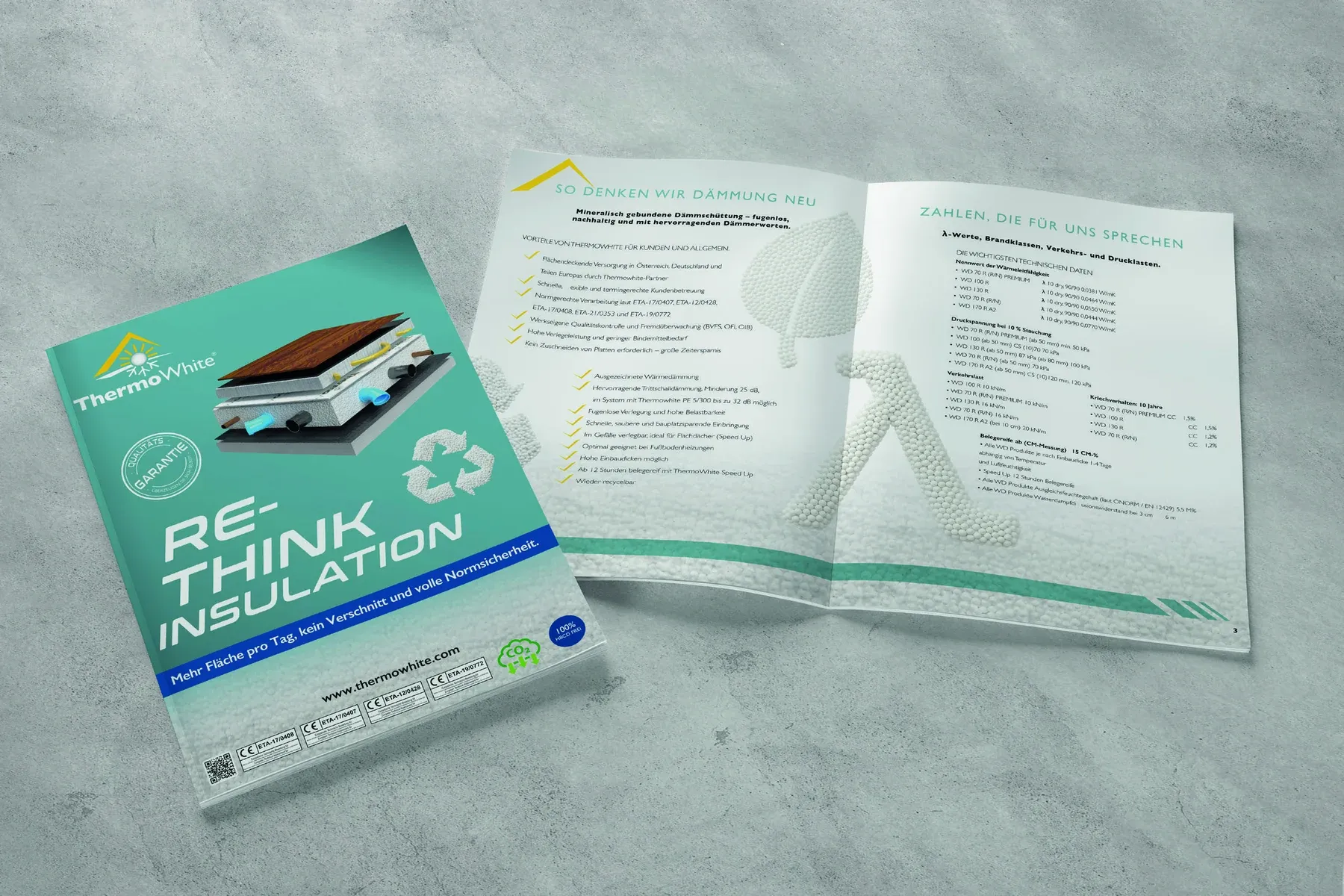
Folders and other print materials combine clear information with strong brand recognition.
TW Model & EPS Sphere
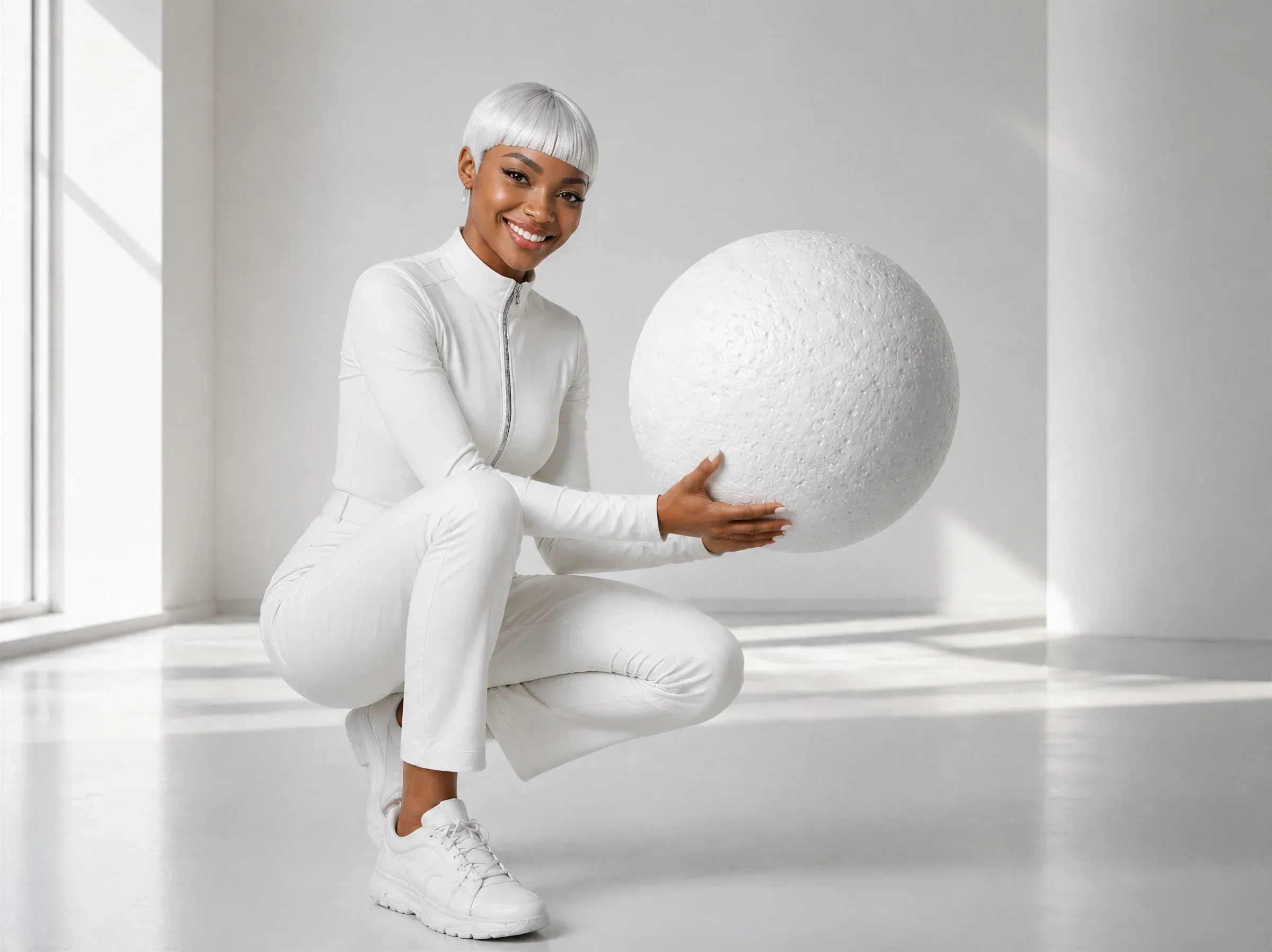
The TW model and EPS sphere reveal what is otherwise hidden within the building element: lightweight technology, precise insulation performance and a material in the circular economy. Whenever the model appears, the sphere is always its visual companion.
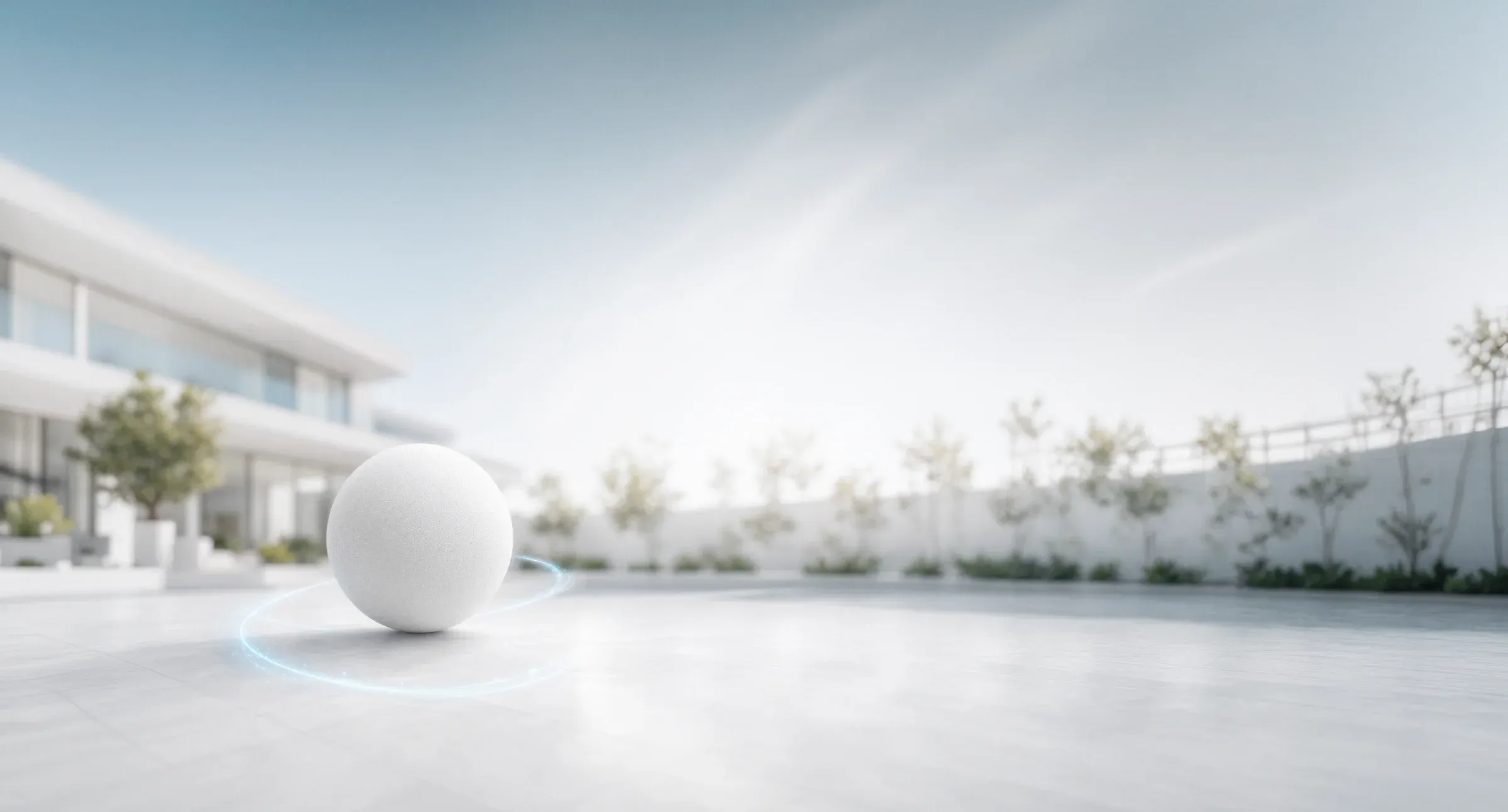
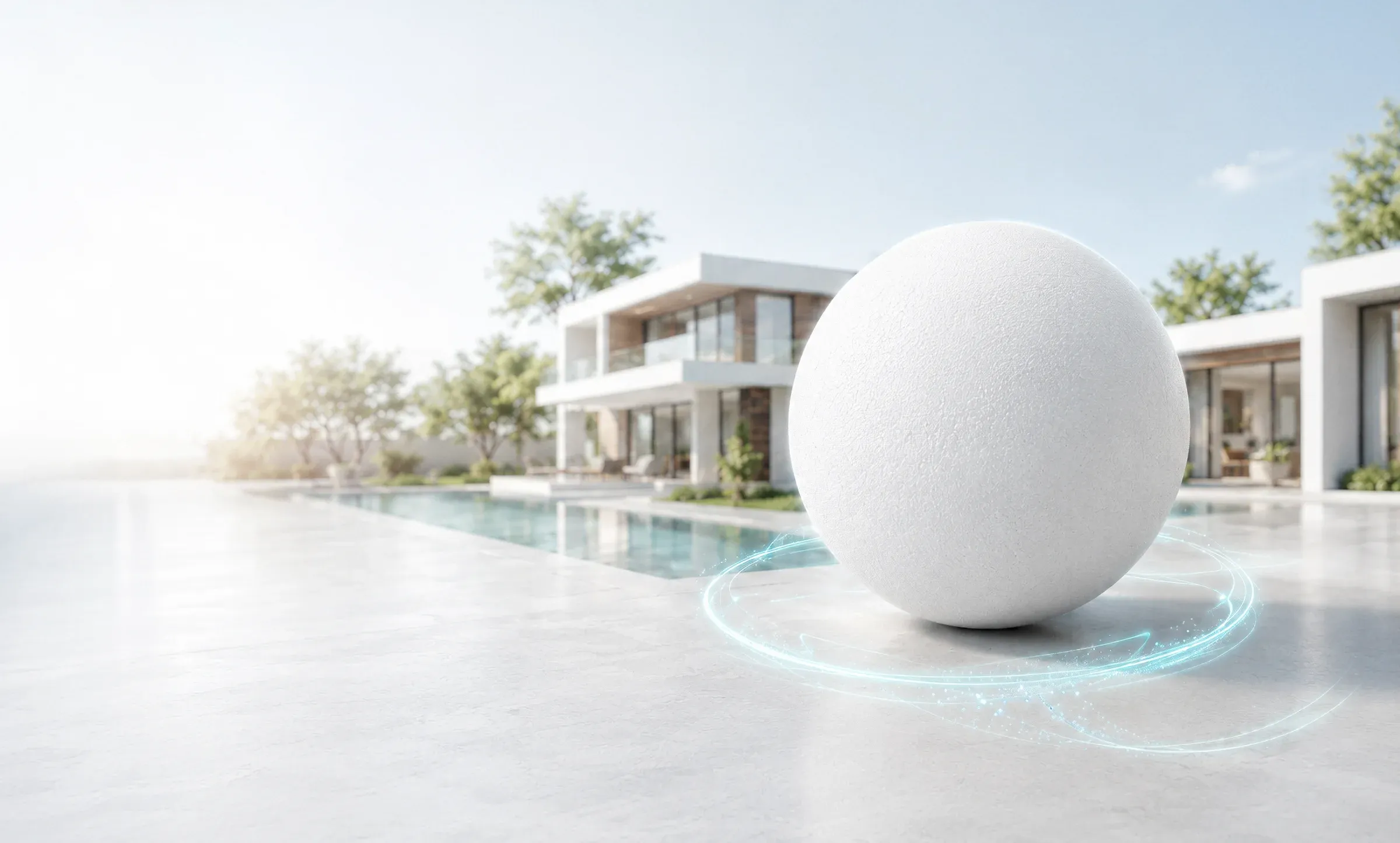
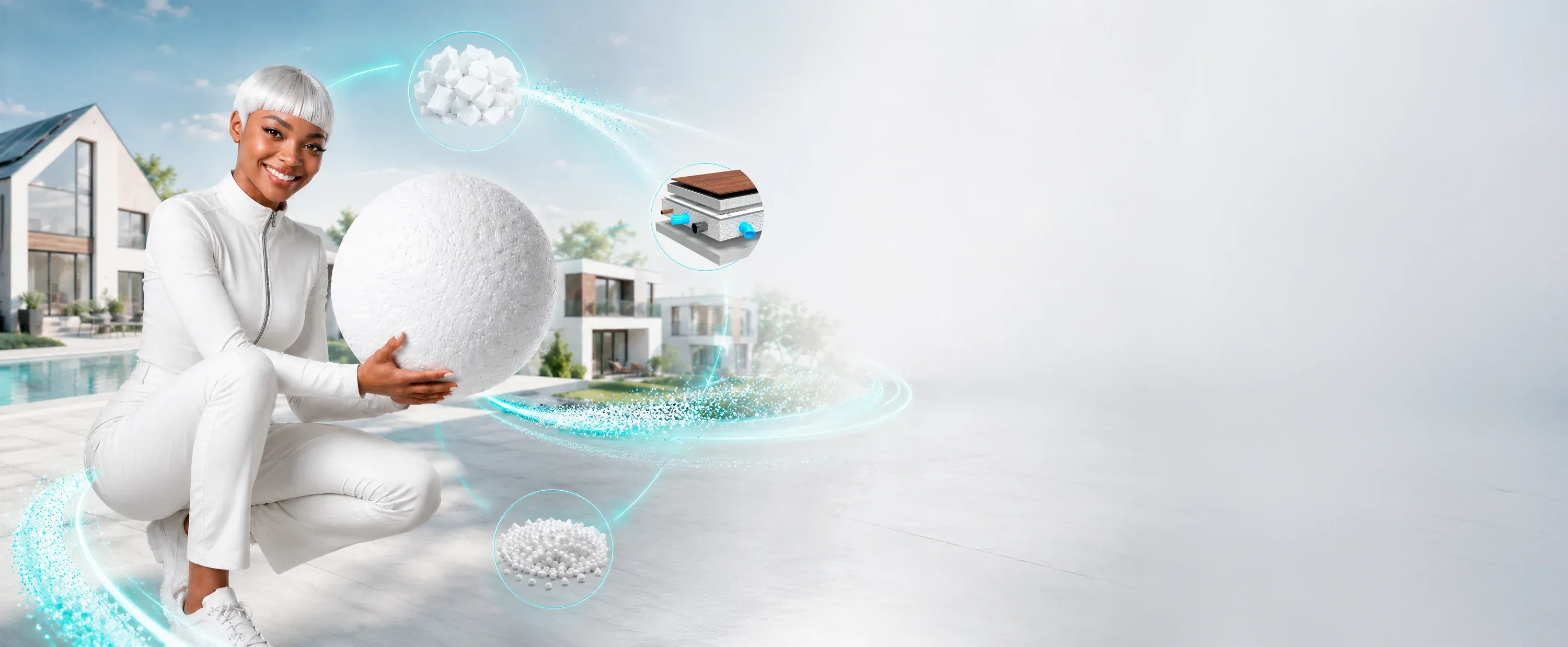
Circular economy scene
The scene connects the TW model and EPS sphere with the stages of the material cycle, from EPS material and its use in floor construction through to recovery and reuse. The illuminated connecting lines make the recycling approach visible and establish it within the ThermoWhite® visual world.
Social Media
Clearly recognisable. Even at small sizes.
One identity for every profile.
A custom square profile image is available for social media channels. It combines the logo, roof element, claim and EPS particles into a compact, recognisable brand motif.